
Dubai’s digital market is competitive. Businesses aren’t just competing on price or product, they’re competing on experience. At Seven Digital, we’ve seen time and again that the gap between a website that generates leads and one that doesn’t often comes down to design decisions that users never consciously notice.
That’s the power of conversion-focused UX. When done right, it quietly guides users toward action. When done wrong, it creates friction that sends them straight to a competitor. This post breaks down the core principles our team applies when building websites designed to perform.
Simplicity, Clarity, and Hick’s Law
Every choice a user has to make costs them mental energy. Hick’s Law formalizes this: the more options you give someone, the longer they take to decide, and the more likely they are to abandon the process entirely.
This “analysis paralysis” is one of the most common conversion killers we encounter. The fix isn’t always a redesign; sometimes it’s simply reducing.
- Limit navigation options to the most essential paths. A cluttered menu signals chaos.
- Streamline forms by removing every non-essential field. Each additional input is a micro-barrier. Hide optional fields like “Address Line 2” behind a link rather than displaying them by default.
- Apply the One Primary Action rule: each screen should present a single, clear CTA. Supporting options can exist, but they shouldn’t compete for attention.
The goal is a layout where users always know exactly what to do next, without having to think about it.
Fitts’ Law and CTA Optimization
Fitts’ Law states that the time required to hit a target depends on how large it is and how far away it is. For web design, this translates directly into how easy your buttons and interactive elements are to engage with.
Small, poorly placed CTAs don’t just look bad, they actively hurt conversions. Here’s how user experience best practices address this
- Make buttons large enough to tap comfortably on mobile. This reduces both physical and cognitive effort, especially during high-intent actions like booking or purchasing.
- Use sticky CTAs (floating action buttons) on scroll-heavy pages. A “Book Now” or “Add to Cart” button that follows the user down the page can lift conversion rates by 20–30% in transactional apps.
- Write benefit-driven microcopy. “Start free trial” outperforms “Submit” every time. The copy around your CTA should answer the user’s implicit question: what do I get if I click this?
Visual Hierarchy and Gestalt Principles

If everything on a page demands attention, nothing gets it. Strong visual hierarchy organizes elements so users naturally gravitate toward what matters most, your value proposition, your CTA, and your proof points.
Web users don’t read pages linearly. They scan. Design for the F-Pattern on text-heavy pages, placing critical information across the top and down the left side. On landing pages, the Z-Pattern works better, guiding the eye from the top-left to the bottom-right CTA.
Beyond scanning patterns, Gestalt principles offer practical tools for reducing cognitive load:
- Proximity: Group related elements together: product image, price, and “Buy” button should sit as a visual unit.
- Whitespace: Breathing room isn’t space; it’s a processing aid. It helps users absorb information faster and makes layouts feel intentional rather than crowded.
- Size and contrast: Draw the eye to conversion points using scale and color contrast. If your primary button blends into the background, it’s working against you.
This is also where the psychology behind great advertising intersects with UX design, both disciplines rely on understanding how people perceive and process information to drive action.
The Aesthetic-Usability Effect and Color Theory
Visually polished interfaces don’t just look better, they perform better. The aesthetic-usability effect is a well-documented cognitive bias: users perceive attractive interfaces as easier to use, which makes them more patient, more trusting, and more likely to complete tasks.
Aesthetically strong designs increase first-impression trust scores by 200% and improve task completion rates. For businesses in Dubai’s premium market, this matters enormously.
Color plays a specific role in this. Strategic color choices do two things
- Direct behavior: Green works well for “Proceed” and confirmation actions; red should be reserved for deletions or cancellations. Contrasting colors on CTAs make them pop.
- Build credibility: Aligning your palette with industry expectations (blue for trust in finance and healthcare, for example) signals competence before a single word is read.
A strong brand identity creates the foundation for these color decisions to land consistently across every digital touchpoint.
Mobile-First Design and UX Patterns
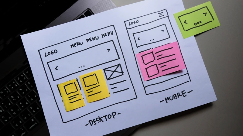
Over 60% of global web traffic now comes from mobile devices. A desktop site that’s been squeezed onto a smaller screen isn’t a mobile experience, it’s a liability.
True mobile-first UX design means rethinking layout from the ground up
- Design for thumb zones: Critical CTA buttons belong in the lower half of the screen, where thumbs naturally rest. Bottom navigation bars serve core sections far better than hamburger menus for mobile-heavy audiences.
- Use progressive onboarding: Don’t overwhelm new users with information upfront. Introduce features gradually as they become relevant.
- Implement card-based layouts: These are easy to scan and naturally adapt to different screen sizes.
- Enable gesture-driven interactions: Swipe navigation accelerates browsing and feels native to mobile users.
Fast load times are equally non-negotiable. As mobile load times increase from one to three seconds, bounce probability rises by 32%. Optimize images, defer non-critical scripts, and compress files to meet Core Web Vitals targets. Where loading is unavoidable, use skeleton loaders, grey placeholder blocks that mimic the layout instead of spinning wheels. They reduce perceived wait time and keep users engaged. Fast, well-structured websites also benefit your SEO performance, making speed a dual-purpose investment.
Frictionless Checkout and Error Prevention
E-commerce sites lose enormous revenue at checkout, not because users don’t want to buy, but because unnecessary barriers get in the way. Optimizing the checkout flow alone can yield a 35% increase in conversion rates.
A few high-impact fixes:
- Make guest checkout the most visible option. 19% of users abandon orders when forced to create an account first.
- Simplify password requirements. Overly strict rules cause up to a 19% abandonment rate among returning users.
- Show exact delivery dates (“Arrives April 4th”) rather than speeds (“2 business days”), which forces users to do mental math.
- Add countdown timers for order cutoffs instead of static timezone text. Urgency and clarity, combined.
- Explain why you’re asking for sensitive information. Over 70% of users hesitate to share a phone number. A simple “So we can update you on your delivery” can be enough to remove the objection.
When errors occur, use adaptive inline validation that explains what went wrong in real time, not a generic pop-up after submission.
Build for the User, Win the Market
Every one of these UX design principles serves the same underlying goal: to remove the obstacles between a user’s intent and their action. The businesses that understand this don’t just get better conversion rates, they build digital experiences that earn trust, reduce churn, and compound growth over time.
At Seven Digital, we combine technical web expertise with user-centric strategy to build websites that perform as well as they look. From website design and development through to paid advertising that drives the right traffic to your optimized pages, our 360-degree approach is built around measurable results.
Ready to turn your website into a conversion engine? Get in touch with Seven Digital and let’s build something that works.